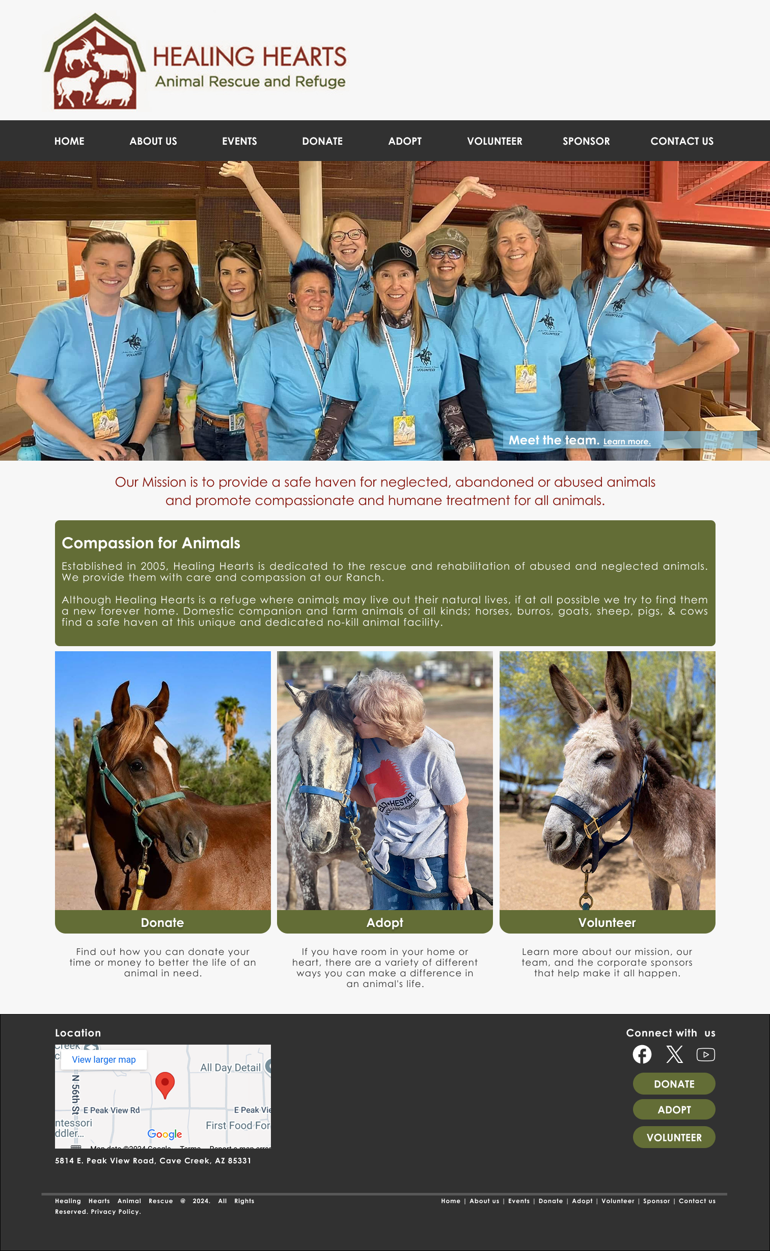
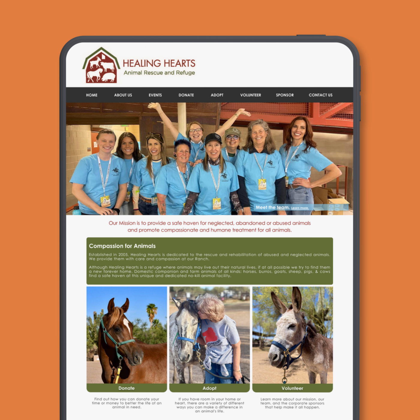
Healing Hearts does incredible work for animals in need. Their website wasn't keeping up. I redesigned it end to end so that the people who wanted to help could actually do it.
0%adoption completion ↑
0weeks · project duration
0user personas built
My RoleUX Research + UX/UI Design
PlatformDesktop Web
Duration14 weeks
CourseGIT 540 · Usability & UX
Outcome+40% task completion
The Problem
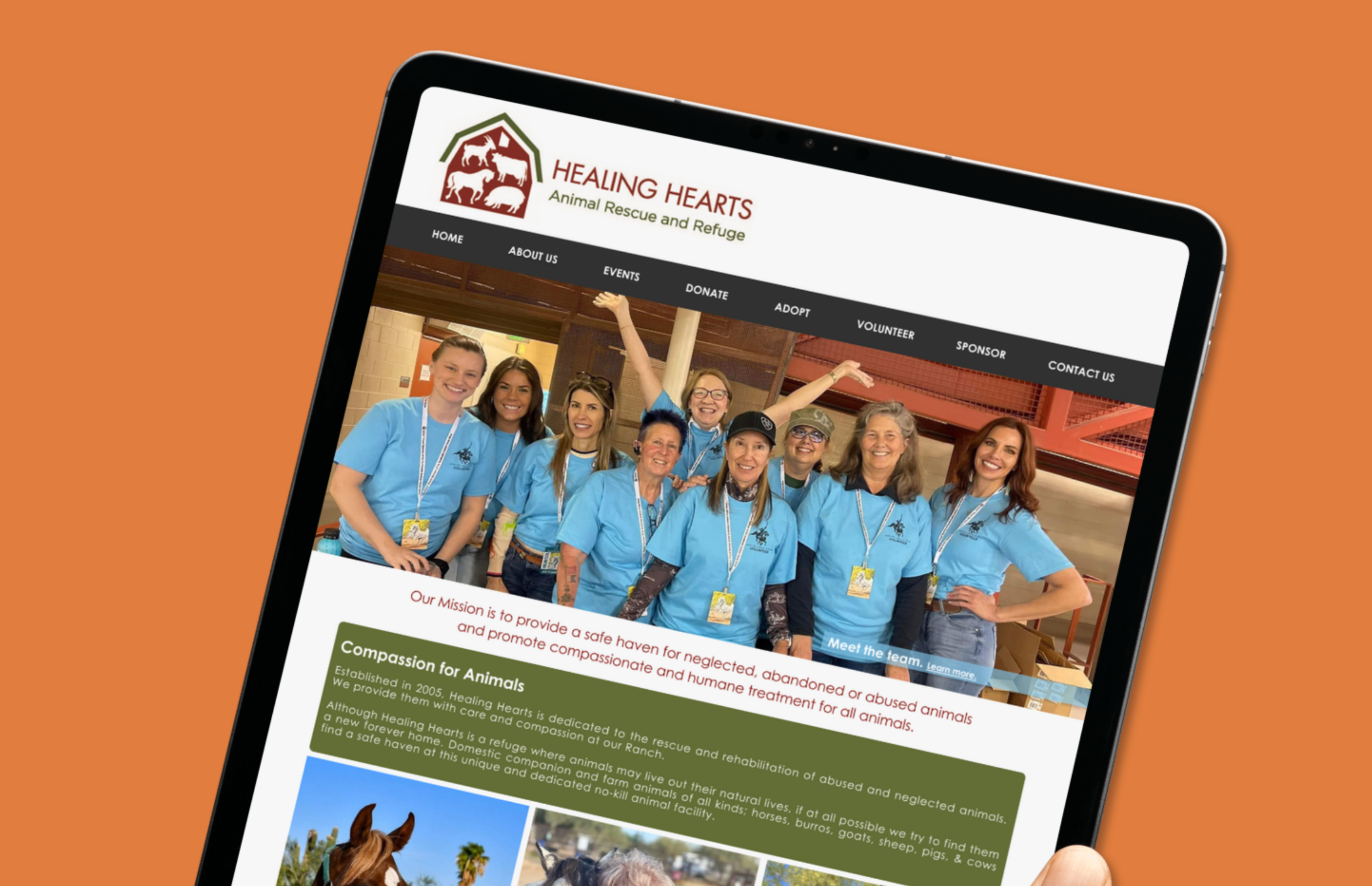
Good mission. Broken front door.
People came wanting to adopt, donate, volunteer. Most left without doing any of it. The cause was real. The site just wasn't keeping up.
Major Key pages buried under confusing navigation
Major 40% of users quit the donation form before finishing
Major Animal profiles had no personality traits or medical info
Minor Volunteer sign-up was scattered across multiple pages
UX Research Process
Before Figma, I needed to understand people.
Not just what looked broken, but why real people were walking away without doing anything.
01
Heuristic Evaluation
Went through every page against Nielsen's 10 principles and documented what I found. Each issue got a severity rating so I could focus on what actually mattered first.
02
User Research
Talked to potential adopters, donors, and volunteers through surveys and informal conversations. 10 respondents, a lot of honest feedback.
03
Accessibility Audit
Ran the site through WCAG 2.1 guidelines. Found contrast failures, missing alt text, and broken form labels that were actively excluding users.
04
Persona Creation
Built 4 personas from real observations: a donor who wants transparency, an adopter who needs details, a volunteer with no time to waste, and a community supporter looking to do more.
05
User Stories
Wrote acceptance criteria for each key flow so every design decision had a clear job and could be tested against real user intent.
06
Usability Testing
Ran 3 task scenarios with real participants. Watched where they hesitated, where they got lost, and what made them give up.
Heuristic Evaluation
Nothing was left to guesswork.
No problem
Minor Issue
Moderate Issue
Major Issue
Catastrophe
User Research
What people actually wanted.
80%
came to adopt or volunteer. These two paths were the priority and the site was making them impossible to find.
50%
wanted more information about the animals. Personality, health history, better photos. Enough to actually make a decision.
70%
said they'd recommend the site to others interested in adopting or volunteering. The goodwill was there. The design just needed to match it.
People cared about the animals. They just couldn't figure out how to help. That gap between wanting to act and being able to was exactly what the redesign had to close.
User Personas
The people I designed for.
Different reasons to show up. Same broken experience standing in their way.
I want to make sure my donation makes a real difference.
TransparencyEasy navigationConfirmation
I need flexible opportunities that fit around my schedule.
Updated listingsQuick sign-upSchedules
I want to contribute more than money. My time and skills matter too.
EventsNewsletterCampaigns
I need clear details and steps to make the right choice for my home.
Detailed profilesStep-by-stepFilters
Visual Design
Refined, not redefined.
Swapped the original serif for Century Gothic. Rounded, clean, warm. It matched the tone of what Healing Hearts is actually doing without trying to look like something it isn't.
Hero36px · BoldHealing.
Heading24px · Semi-boldAdopt a friend.
Body16px · RegularEvery animal deserves a home.
Color Palette
#646d37Olive Green
#323031Deep Charcoal
#b59e82Dusty Beige
#7c533bEarthy Brown
#eef1f3Light Mist
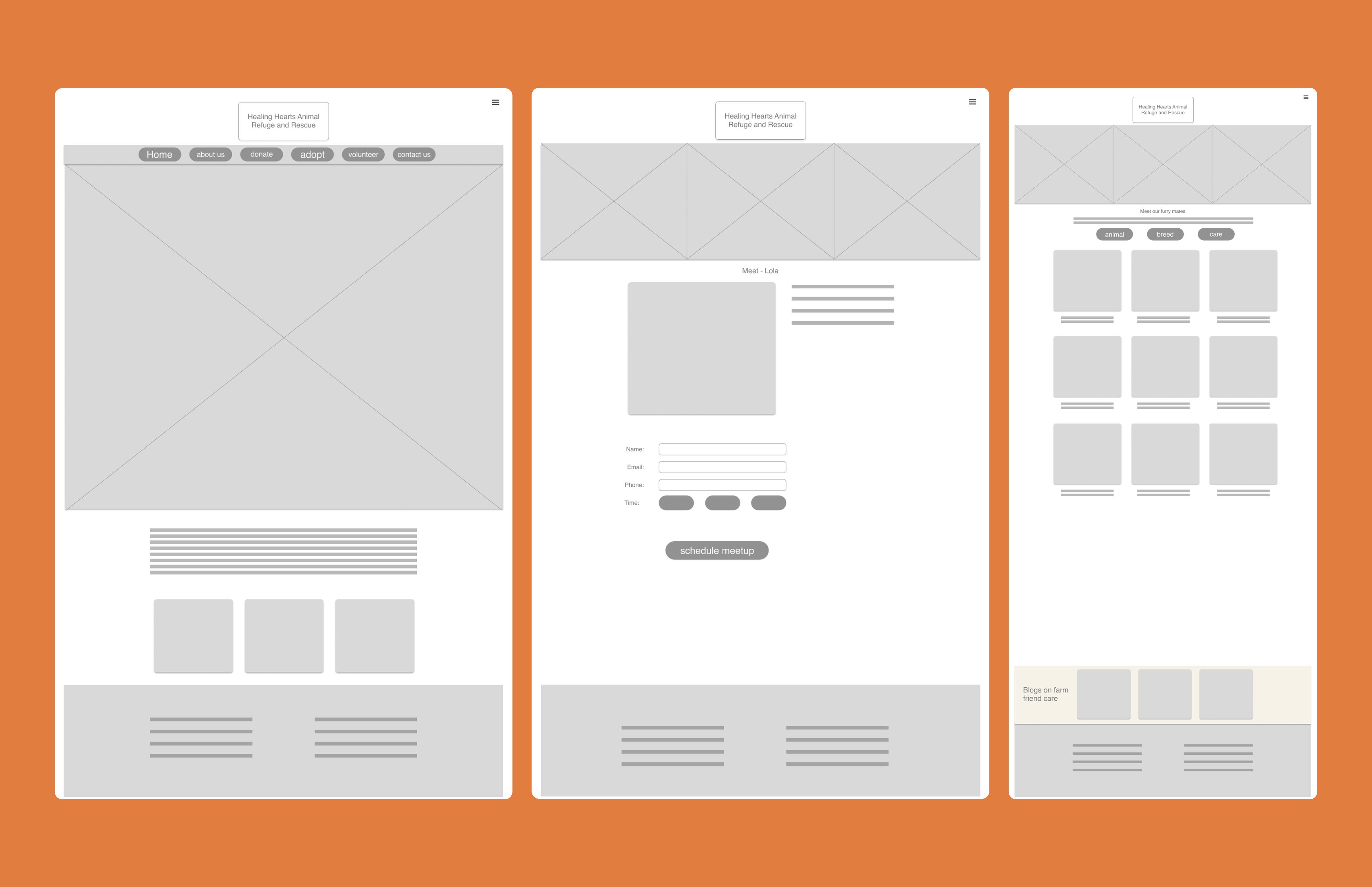
Wireframes
Structure before surface.
Three paths — adopt, donate, volunteer — needed to be obvious the second someone landed on the page.
High Fidelity Prototype
Three flows. One experience.
Three flows, rebuilt from scratch. A clear next step at every point.
Adoption walkthrough
Donation page walkthrough
Volunteer page walkthrough
The Outcome
+40%
increase in adoption completion. Clear path + real info = people follow through.
Navigation redesigned
Cleaner nav, clearer hierarchy, consistent structure across every page. No more hunting for the Adopt button.
Donation simplified
Fewer fields, a progress indicator, and a confirmation that tells you your gift landed. Simple works.
Animal profiles enriched
Real photos, personality notes, medical info, and filters so people could actually find the right match for their home.
Volunteer hub built
One page with all the info: role descriptions, available schedules, and a sign-up form that took under a minute.
"The goal was simple: make it easier for people to connect with the cause, whether they want to adopt, donate, or just learn more."